Squircles in CSS!
A brief on the new corner-shape property.
Just wanted to shout out this cool new feature coming to CSS: you can now specify exactly how round you want your border-radii to be.
A normal radius would look like this:
The border corners are just arcs of circles. This is what the new property looks like:
css
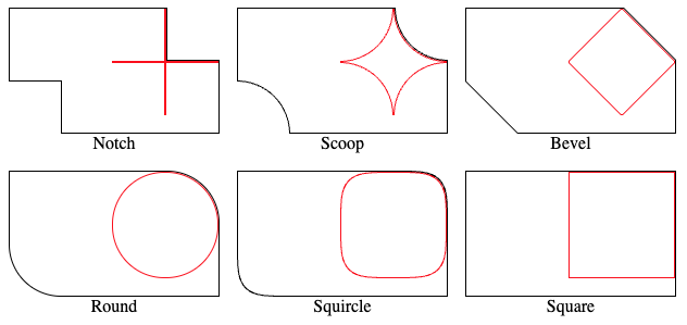
corner-shape: notch;    /* or superellipse(-infinity) */
corner-shape: scoop;    /* or superellipse(-1) */
corner-shape: bevel;    /* or superellipse(0), a straight line */
corner-shape: round;    /* or superellipse(1), default. */
corner-shape: squircle; /* or superellipse(2) */
corner-shape: square;   /* or superellipse(infinity) */

/* You can also specify each corner separately. */
corner-shape: square squircle bevel scoop;  /* top-left, top-right, bottom-right, bottom-left */
Lined up, they look like this:
corner-shape.
corner-shape. A rendered image is provided.
You might want to use this effect for mimicking an iOS-style squircle, since previous ways of doing this had to use SVG masks. If you want to see more interesting ways of using this new feature, see CSS-Tricks article about it. (I think we might have a good replacement for the classic CSS Triangle!)
Further Reading
corner-shape(MDN)- This page has a good example that demonstrates this property.
superellipse()(MDN)- What Can We Actually Do With corner-shape? (CSS-Tricks, mentioned above)