I think — at least for me — that blogging is a form of journaling. I feel like if I was journaling physically[1] I would love to take care of a physical tome containing my thoughts. Decorate it, take care of it, et cetera. Following this logic, I take great joy in taking care of my website. Polishing the CSS, adding nice features, making a nice favicon[2], and other stuff (sorry I have been working on it a lot recently.) So, uh, I think I want to just gush about all the changes I have made recently to my site, and maybe circle back to some deeper point about self-love.
Favicons are weird
I have many questions about favicons.
- Why are they called favicons?[3] Favorite icons? Shouldn't they be called like bookmark[4] icons or something? Did they make this up in like Netscape Navigator or Internet Explorer or something?[5]
- Why are they so small? It's really hard to represent anything in a 16×16 square. At least we can now use 32×32, and people who know their way around a vector design program can use an SVG.
-
How have we not come up with a better way of linking an icon to your
website than stuffing a bunch of
<link>tags in your<head>[6]??
Um. Sorry about all the footnotes. When I started working on my current
iteration of my site, which I arbitrarily named V4, I was getting into
drawing at the same time. I wasn't sure what to fit in that thing, so I just
put the drawing I had in there. It uh. It looked bad. Here's a recreation:
. Ew, right? So a few months ago I made this new drawing, the dialog box
deer that you have definitely seen on this site already. And I realised that
I can adapt it into a favicon:
. Much clearer, right? Just bicubic scaling the image down makes it quite
readable, which I was honestly shocked at.
Changing fonts


I'm a programmer first, not a writer. So when I was making my website, it just made sense to add a touch of monospace to it. I imported my terminal font (Maple Mono) into my project and set it as a heading font, italicized with cursive symbols. Though I was getting kind of tired of it. I don't think monospace fonts look that good when at such a large size. So I found this new font on Google Fonts (where else?) called Hepta Slab and fell in love with it immediately. It's still very round, which captures the sort of look the rest of my fonts have (the sans-serif font is DM Sans) while feeling way more in place than a monospaced font.
I think people all have complex relationship with fonts. Though maybe that's just my autism speaking. People hate Comic Sans. People love to write Word documents with Arial. Web developers love Inter. Everyone sort of has their own font, in their handwriting[7]. You might feel comforted by a monospace font. Cursive might remind you of rigid school structures.
Physicality
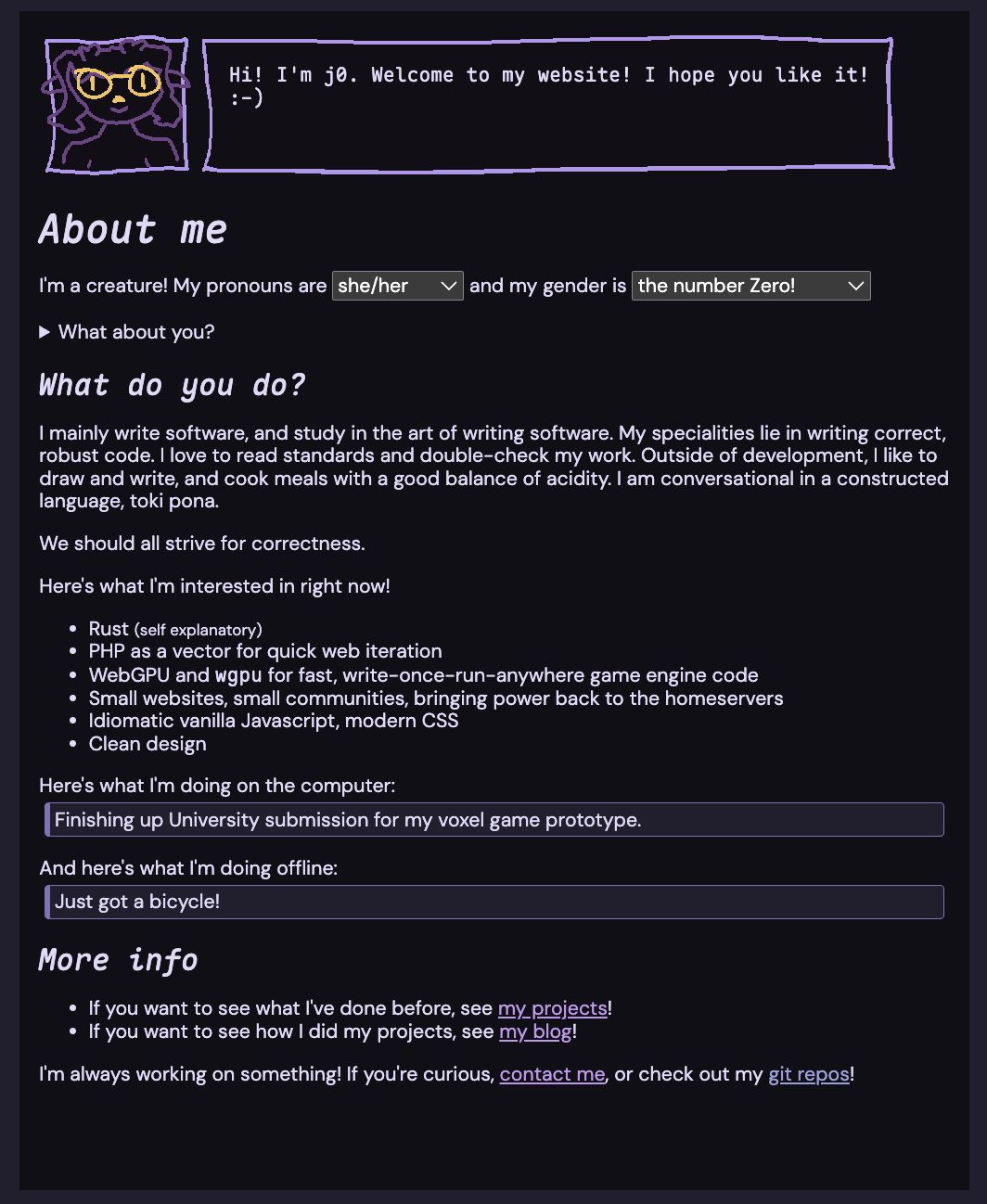
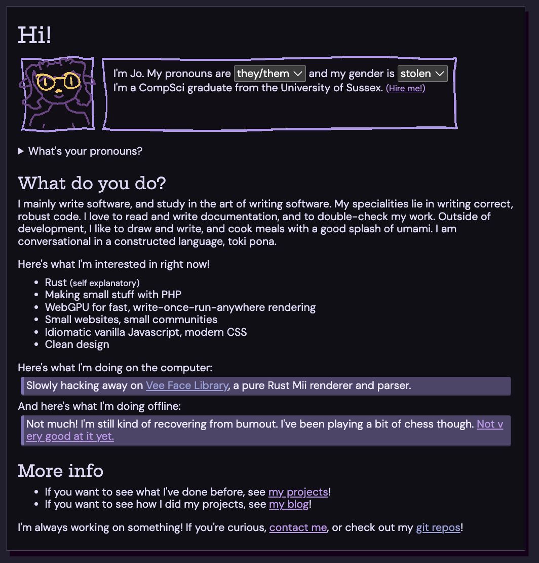
As someone with autism, I have a divine fixation with tactile things. Shapes feel nice. During this redesign, I've been trying to add physicality wherever possible. This isn't just because of Apple's Liquid Glass design language, but I think flat design is boring generally. I think many people do??
I've been adding physicality wherever possible. The figures now have a shadow and border. Well, I haven't really been able to add it anywhere else, due to some rigid CSS limitations. I'll figure it out eventually. I hope this looks good!
Cute little icons


I found a new icon library: CSS.gg. They serve very simple SVG icons you can just throw in your source. These have been sprinkled around where necessary.
Code Blocks and Highlighting
fn main () {
println! ( "Here's a code block!" );
// Explode
unsafe { unreachable_unchecked! () }
}
I'm currently using Prism.js for code highlighting. It's widely supported, has good theming, and a heck of a lot of language support. Um. The only issue is that it doesn't really make sense in $CURRENT_YEAR. Since the advent of tree-sitter, code highlighting is done via syntax trees instead of regex parsing. It's faster, and makes more sense. However: tree-sitter is written in a compiled language. This makes it a pain to run in the browser [8]... There's web bindings via wasm on npm, but it would need a bit of work to use to highlight. Plus, I'm sort of worried about the size of WASM blobs. Each language requires its own blob, so I could be pulling in several wasm blobs on every site. Prism.js is (at time of writing, on this site) big. As a test, I pulled in tree-sitter JS, WASM and the Javascript WASM blob. That alone (without any highlighting code or anything!) is . Yipes!
So this is why I'm using Prism. There are other regex-based highlighters, but this one works fine. One thing I added recently is the little language tag, which makes it more obvious which language is in the code block. I added it for my blog post where I talk about Swift in comparison to Rust.
About footnotes
Umm. I like tangents. You might notice the large footnotes section on this article. This was pretty fun to implement! If you've used markdown, and not really thought about writing in HTML, you might assume that footnotes are a HTML primitive. Nah! My current implementation looks like this:
< p >
This is a paragraph < a ref ="umm_actually "></ a > .
</ p >
< footer >
< h2 id ="notes_heading "> Footnotes</ h2 >
< ol >
< li id ="note_umm_actually ">
Well, there's not really much text there. Its a sentence.
Should it really even be put in a p tag?
It's kind of semantically wrong.
</ li >
</ ol >
</ footer >
A script comes along and fills out
everything to be semantically correct HTML. It's based on this
great article about making footnotes accessible, but I tweaked it a bit to remove markup boilerplate. Note that the
<a> tag uses ref, not href. Not
sure if this attribute is used in other places, but I thought it would be
fine to use here. (It gets stripped by the script and replaced with a
href.)
One fun issue I found is that the "return" ↩ symbol looks different depending on browser. Mobile browsers (at least mine) will make it an emoji, while desktop browsers will use a normal font. You can choose this behaviour by suffixing a unicode character:
| Default | ↩ | ⛄ |
|---|---|---|
Variation Selector 15 ︎ |
↩︎ | ⛄︎ |
Variation Selector 16 ️ |
↩️ | ⛄️ |
Aside on writing in HTML
I think HTML might be the most expressive way to write. You can express almost anything (see the fonts section :p) and it doesn't have the same issues that other markup formats have with wordiness (if you think HTML is bad, see .) I see most bloggers using markdown and I wonder: why? It makes everything harder. If you want to have a "component", you basically have to extend markdown, then have a framework or preprocessor to convert into HTML. You can put HTML in markdown (sometimes), but the syntax is very odd. Either way, it's gross.
I think people are scared of HTML. It's not that hard to write, and you can
use Emmet to write a lot of HTML from very
understandable abbreviations if you have worked with CSS.
footer>h2#notes_heading+ol>li*3 produces an entire footnotes
section from earlier, and it lets you use tab to jump between text fields to
fill.
You also lose a lot of
semantic information
with markdown. You could represent a
figure>img+figcaption
like this:

This is an image.
But what happens when you want to style a figure? If you want to center the
caption, frame the image, add a ::before pseudo-element with a
counter, etc. What will a screen reader do when it comes across your figure?
Not what you want it to do!
So it's either restrictive, ugly, or heavy. Um, maybe that was convincing. I
think using HTML thoughtfully like this makes you better at using HTML
thoughtfully elsewhere. When writing in HTML, go to
MDN
and think: "Is there an element for this?" By doing this, you'll learn about
new tags like <samp> for quoting output from a program,
<abbr> for acronyms or abbreviations, all of MathML,
<ruby> for displaying
pronounciation
. It's fun :)
Trying to conclude this post
I've had a lot of fun writing this post, as well as working on my website. HTML+CSS is one of the most expressive technologies we have in software development. Working on your personal website is, I think, a form of self love. It's a construct built for the express purpose of self-expression. Express yourself!